Get in touch
Being seen starts with a click.
Being seen starts with a click.
Result: Making dignified living visible in a loaded sector
Imagine it's three o'clock in the morning. A pipe bursts in a building where 200 people are asleep. What do you do?
At NL Realty, they answer the phone. Every time. They have done so for the past 27 years.
Across the west coast of the Netherlands, they provide temporary accommodation for thousands of migrant workers—people who have travelled far from home to work in a country they don't yet know. And when something goes wrong—a broken boiler, a conflict between residents, or a missed key handover—there's always someone ready to sort it out.
That's no small responsibility.
But ask what NL Realty actually does, and the answer isn't immediately clear. Property? Housing? Facility management? They're all part of the picture, but none of them captures the heart of the business.
Every session leaves us laughing and full of energy. I've never seen the team this enthusiastic. It has given our sense of connection a real boost.
We spoke with the team, their clients, and the local authorities who see them as a trusted partner. Everywhere we heard the same message: they never stop. They keep their promises. And when things get difficult, they're the ones who show up.
That became the heart of the brand.
Not a story about property. A story about providing certainty to people in a vulnerable situation. About taking decisive action with genuine care.
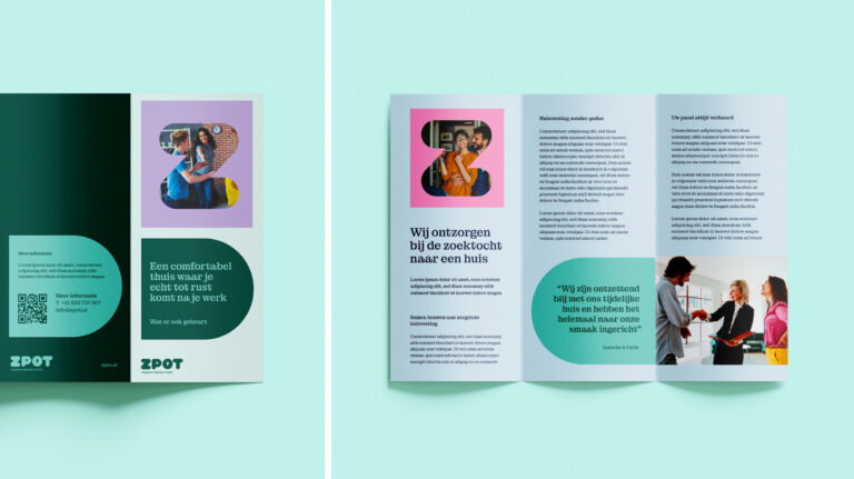
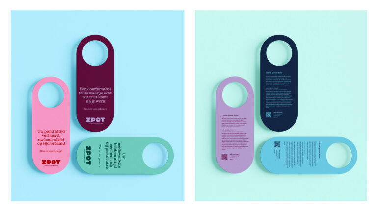
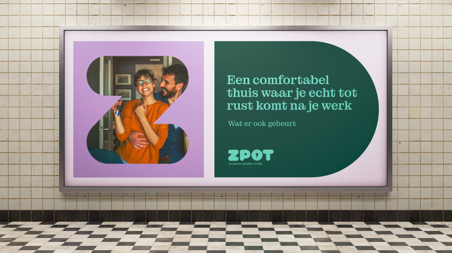
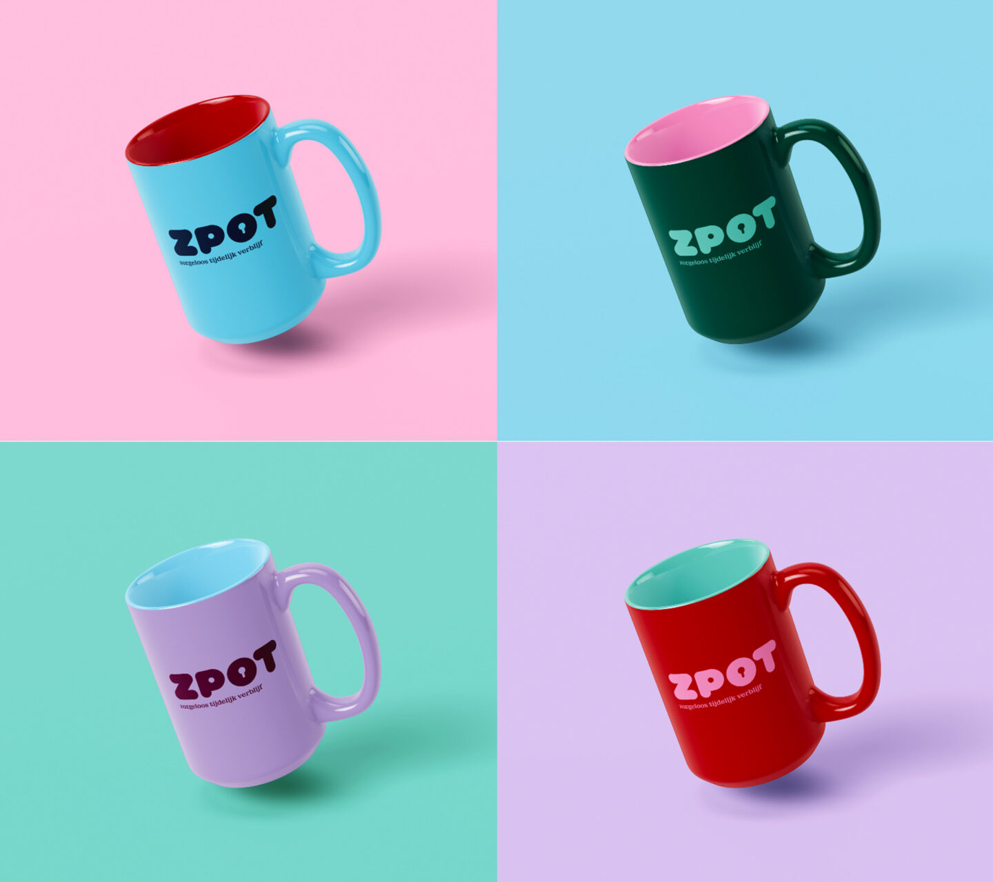
The new name became Zpot. A place to rest. The Z evokes sleep, while spot represents a place of your own. It came with a promise that leaves no room for doubt:
"No matter what"
No small print. No caveats. Just a simple commitment: we'll take care of it.
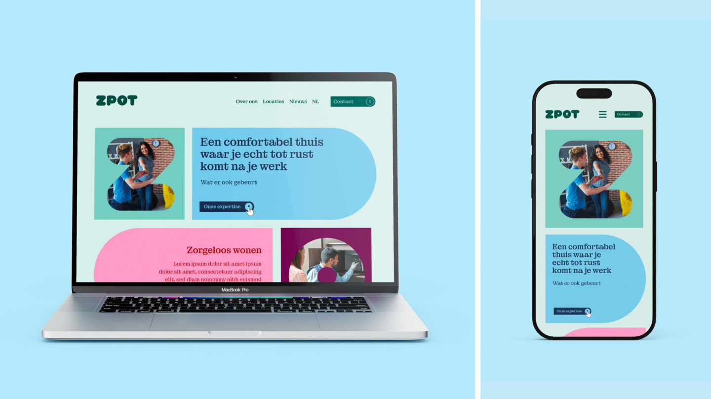
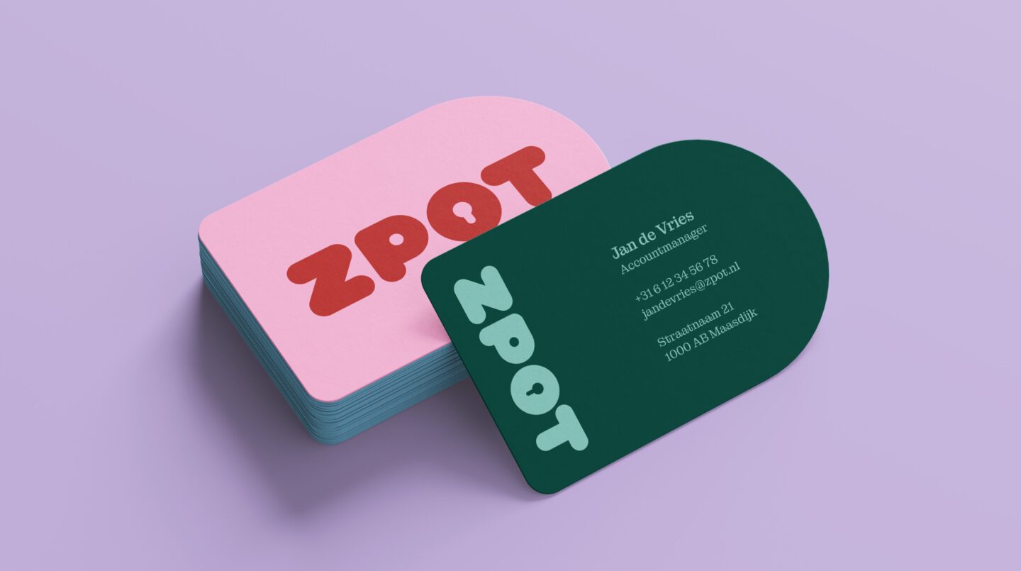
Everything else followed naturally. A visual identity that feels warm without becoming soft. Photography that shows real people in real situations. And a tone of voice that says exactly what it means—clear, honest, and without unnecessary words.